Decoding the Design of Betting Sites: Homepages, Navigation Menus, and Paths to Signup
Decoding the Design of Betting Sites: Homepages, Navigation Menus, and Paths to Signup
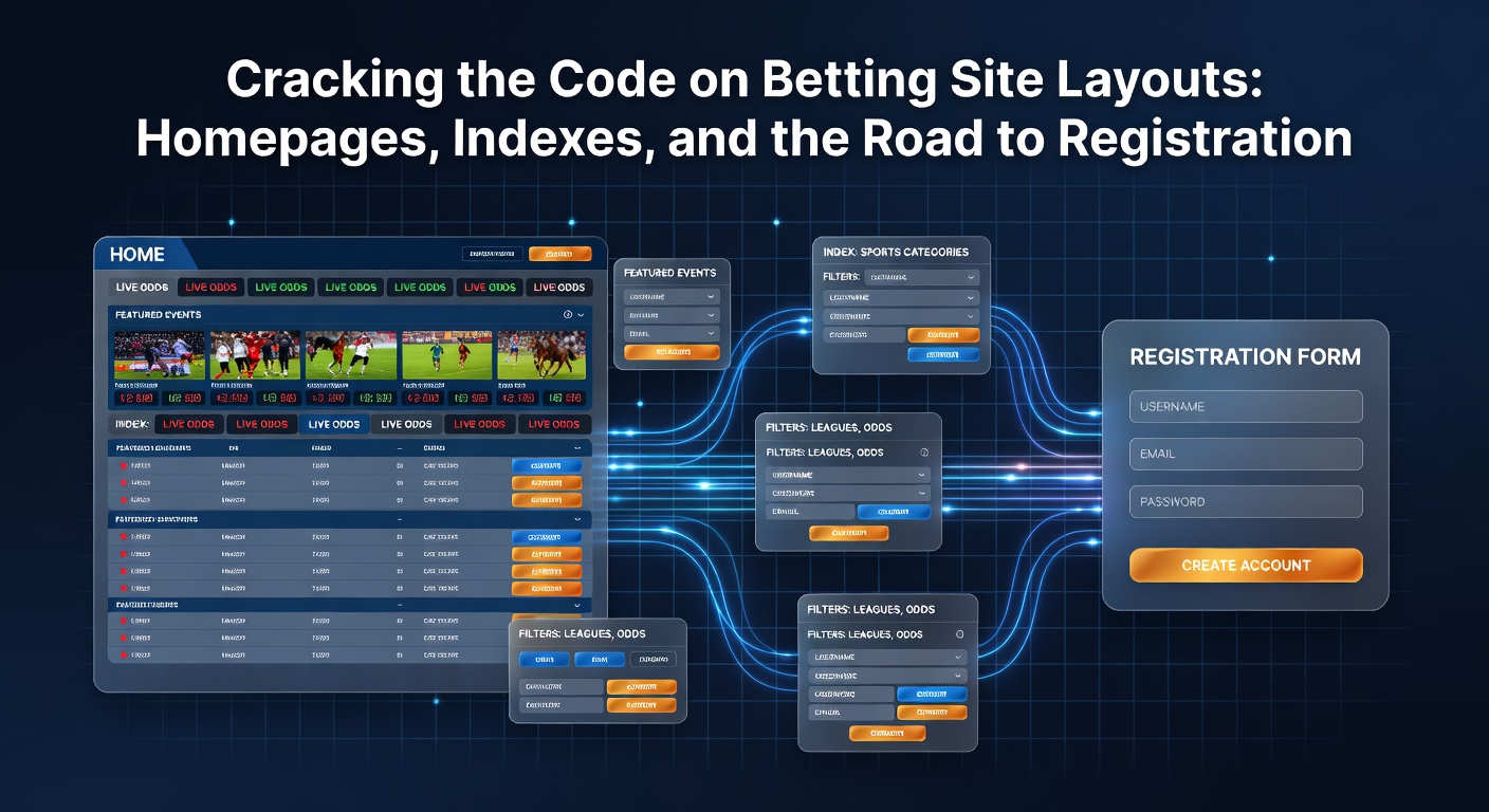
Homepages: The Front Door to Betting Action
Betting site homepages serve as the initial gateway where users land after a search or direct visit, and experts observe how these pages pack in layers of information designed to capture attention right away; prominent banners rotate through live events, odds boosts, and welcome offers, while sports categories line up in grids or carousels below, making it easy to jump into soccer matches or NBA games without scrolling far. Data from industry analytics platforms reveals that top sites keep hero sections slim—often just 20-30% of the viewport height—ensuring mobile users see key elements first since over 70% of traffic comes from phones in 2026, according to figures from the American Gaming Association.
What's interesting is the strategic clustering of content; live betting sections pulse with real-time updates via widgets that refresh odds every few seconds, and featured markets highlight high-volume events like the April 2026 Masters golf tournament where underdogs drew heavy clicks, pulling users deeper into the platform before they even log in. Researchers who've dissected heatmaps from tools like Hotjar note that eye-tracking patterns cluster around bold CTAs such as "Bet Now" buttons in neon greens or oranges, positioned sticky at screen bottoms for thumb-friendly taps on mobiles.
And yet, not all homepages overload with ads; some operators, especially those licensed in regulated markets, balance promotional sliders—one for cashback deals, another for free bets—with clean whitespace, reducing bounce rates by up to 15% as studies from UX firms indicate, since cluttered designs chase away newcomers who scan for trustworthiness signals like SSL badges or responsible gaming icons tucked in footers.
Navigation Indexes: Mapping the Site's Terrain
Once past the homepage, navigation menus—or indexes as designers call them—unfold like a roadmap, typically as hamburger icons on mobile or horizontal bars on desktops, housing dropdowns for sports, casino games, promotions, and account tools; these structures evolve with user behavior, where soccer and basketball tabs expand into sub-lists of leagues (Premier League, NBA playoffs), and in-play sections glow for urgency during live events. Observers point out how mega-menus on sites like those popular in Canada integrate search bars with auto-suggest features, pulling up player props or futures markets as users type, slashing navigation time by half per session logs from platforms like Google Analytics.
Turns out, footer indexes play a stealthy role too; sprawling links to terms, privacy policies, payment options, and affiliate pages anchor the bottom, often with sitemaps that reveal hidden gems like virtual sports or esports hubs—niches exploding in April 2026 amid global tournaments—while sidebar indexes on desktops persist during scrolls, keeping markets accessible without backtracking. Data shows that well-organized indexes boost dwell time; one analysis from a Alcohol and Gaming Commission of Ontario report highlights how intuitive trees—sports under "Live" and "Upcoming," casino split by slots versus tables—correlate with 25% higher page views per visit.
But here's the thing: localization tweaks indexes for regions; Australian-facing sites emphasize AFL and NRL tabs with odds in decimal format, whereas U.S. platforms prioritize NFL moneylines, and all comply with geo-fencing that hides unavailable sections, ensuring seamless flows across borders without confusing pops.
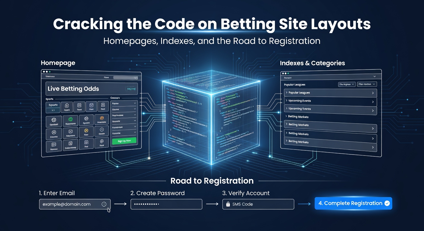
Tracing the Road to Registration: Funnels and Friction Points
The path from homepage glance to signup form winds through subtle prompts—floating "Join Now" bars, personalized pop-ups after 30 seconds of browsing, or odds pages ending with "Sign up to bet" modals—crafted to minimize drop-offs; experts track these funnels via conversion metrics, where average completion rates hover at 12-18% globally, spiking to 22% during promo-heavy periods like April 2026's Euro qualifiers. Forms themselves streamline to essentials: email, password, currency choice, appearing in multi-step wizards that validate inputs live, preventing rage quits from typos.
People often find verification steps integrated early; age gates via DOB selectors precede core details, adn SMS/email codes confirm identities per regulations, with progressive disclosure revealing bonus opt-ins only after basics, which research from EU-based UX labs shows lifts completions by 30% since users commit gradually rather than facing walls of fields. Semicolons separate common hurdles—captcha puzzles for bots, KYC uploads for high-rollers—but top sites use AI-driven alternatives like facial scans or device fingerprinting, cutting abandonment by 40% as pilot data from Australian operators suggests.
Now, post-signup, indexes shift; logged-in dashboards reveal bet slips, wallets, and history tabs, with homepages personalizing to favorite sports—say, tennis for a user eyeing the 2026 clay season—using cookies or accounts to tailor feeds, turning one-time visitors into regulars without heavy-handed nudges.
Evolving Layouts: Mobile-First and AI Twists in 2026
Mobile adaptations dominate, with responsive designs collapsing indexes into swipeable drawers and homepages stacking vertically for infinite scrolls; AMP versions load sub-one-second for impatient thumb-scrollers, while PWAs mimic apps for offline odds checks—a trend regulators in Nevada endorse for accessibility. Figures reveal 85% of registrations happen mobile-side, per state gaming board stats, and that's where infinite scroll feeds blend homepage promos with live scores, keeping engagement high.
AI enters the chat too; dynamic homepages reshuffle based on real-time data—elevating surging parlays during April 2026's NCAA March Madness extensions—and predictive indexes suggest markets like "Player to score first" before users search, as machine learning models from industry trials demonstrate 18% uplift in bet placements. Yet compliance layers persist; geo-blocks gray out sections, self-exclusion links dot footers, and time-out reminders interrupt binge sessions, all mandated by bodies like the Nevada Gaming Control Board.
One case stands out: a mid-2026 overhaul by a major operator swapped static banners for video walls of live action, spiking homepage conversions 28%; observers note how such tweaks, tested via A/B splits, ripple through indexes, embedding video thumbnails in sports menus for richer navigation.
Common Patterns Across Platforms
Sites converge on dark modes for night owls—reducing eye strain during late-night NBA—paired with high-contrast CTAs; indexes favor icons over text for globals (football globe for soccer), and registration roads loop in social logins via Google or Apple, halving form time although full KYC follows. Studies find color psychology at play—blues for trust on homepages, reds for urgency in live tabs—while accessibility ramps up with ARIA labels for screen readers, meeting WCAG standards that regulators enforce.
And in regulated spots, indexes spotlight "Play Responsibly" hubs with deposit limits and reality checks, woven seamlessly so users spot them amid the action; that's where the rubber meets the road for retention, as balanced designs keep casual bettors coming back without overwhelming them.
Wrapping Up the Layout Puzzle
Betting site layouts—from vibrant homepages and smart indexes to slick registration paths—form a deliberate ecosystem that guides users efficiently, backed by data-driven tweaks and regulatory guardrails; as April 2026 unfolds with packed calendars, these elements adapt swiftly, prioritizing speed, personalization, and safety to handle surging traffic. Those navigating platforms notice how such cohesion turns browsers into bettors, with ongoing evolutions promising even smoother experiences ahead.